
Quick answer
If your psychic site looks polished but still leaks bookings, the problem is usually not branding. It is the trust flow: visitors do not see what they get, what it costs, and what happens after they click. A strong site makes the offer obvious, keeps the booking step short on mobile, and shows enough proof to calm a skeptical first-time visitor without making big claims. If the page does not move someone from curiosity to paid session in one clear path, it is too decorative for this niche.
What psychic website design must do before it tries to impress anyone
Most psychic sites fail for a simple reason: the visitor arrives cautious, then gets asked to solve the offer on their own. That is expensive. Every extra second spent decoding the page gives the visitor more time to wonder whether the reading is real, whether the price is fair, and whether they are about to enter a dead-end booking flow.
A site for this niche should do three jobs fast. It should orient the visitor, prove that the business is legitimate enough to trust, and make the next action obvious. If one of those jobs is missing, the page can still look elegant and still lose the sale. That is why the structure matters more than the mood board.
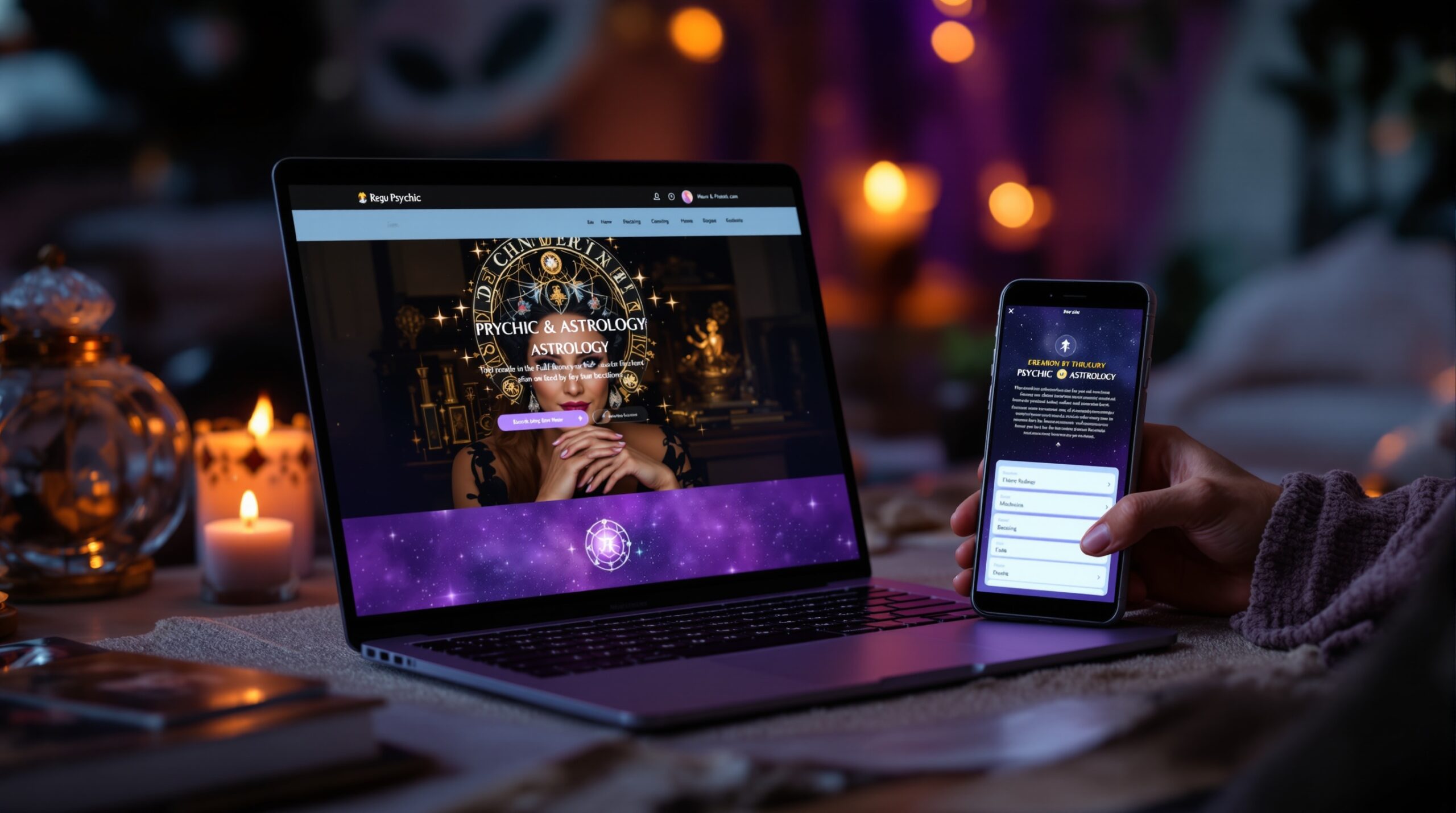
For a service that sells private time, the site is not a poster. It is a conversion system. That is also why a site architecture that feels more like a working intake flow than a brochure usually performs better, especially when live sessions, private chat, or paid video readings are part of the offer.
Trust architecture for psychic businesses
A visitor rarely lands on a psychic website ready to believe. Most people come in with mild doubt, and some come in with a lot of it. The page has to answer the right question at the right moment: who is this, what do I get, and why should I trust the booking process?
That answer should not be spread randomly across the site. A homepage should orient. A service page should explain the reading. An about page should make the reader feel human and credible. A booking page should remove doubt instead of adding more copy. When those jobs are mixed together, the visitor has to reconstruct the offer themselves, and most will not do that work.
For a quick benchmark, the W3C accessibility guidance is useful even though it is not written for psychic services. Clear labels, readable layouts, and low-friction task flow help people finish a booking without stopping to guess. That matters here because uncertainty is the thing you are selling against.
Homepage: orient the visitor in one screen
The homepage should answer the fastest question first: what kind of reading is this, and what should I do next? If the visitor has to scroll to find the offer, the page is already behind. A strong homepage does not try to prove everything. It only needs to name the main service, show the audience it serves, and point to the next step.
Do not overload the first screen with mystical wording, scattered service options, and three different buttons. On a small phone screen, that looks like hesitation. One reading type, one clear price or starting range, one primary CTA. That is enough to start the conversation.
Service page: explain the offer without making the reader guess
The service page does the real selling. It should show the session length, format, price, and what the reader can expect from the appointment. If the reading has limits, say so. If the session is live and private, say that. If the user can book a chat, a video call, or a written reading, distinguish the formats clearly.
Vague lines like “spiritual guidance” or “powerful insight” are easy to write and hard to buy. A visitor who cannot compare options will delay the decision and often leave. A good service page behaves like a product page: it makes the offer legible enough that the buyer can decide without support.
About page: make credibility feel real, not staged
The about page should not read like stock copy from a template. It should show a real person, a real method, and real boundaries. Experience matters, but so does specificity. The reader wants to know whether this is a solo practitioner, a team, or a marketplace, and whether the person behind the page has enough clarity to handle a paid session professionally.
Proof here does not mean grand claims. It means enough detail to reduce the feeling that the page could belong to anyone. A short bio, a clear method, and one or two honest markers of experience usually work better than a wall of mystical language.
Booking page: remove doubt before you ask for payment
The booking page should feel calmer than the rest of the site. It should show the price, the session length, the delivery method, and the confirmation step before the user commits. If payment and scheduling happen separately, the handoff has to be obvious. Hidden fees, vague confirmation language, or long forms raise the risk that the visitor stops halfway and never returns.
That is where conversion is often won or lost. A reader who is willing to buy a session may still abandon the page if the booking step feels uncertain. In this niche, trust is often won by showing less, not more: fewer fields, fewer clicks, fewer mysteries.
How to present readings, packages, and session details
Psychic services are hard to compare if the site hides the specifics. That is why the page should present each reading like a distinct offer, not a spiritual blur. A visitor should be able to see the format, duration, price, and a realistic idea of what the session covers before they click.
Short sessions, longer sessions, and premium private calls do not need the same layout. A quick tarot reading may need a single card-style offer block. A deeper consultation may need a more detailed page with expectations and boundaries. The mistake is to use one generic box for everything and hope the buyer figures it out later.
Clear structure also helps a business avoid support churn. When the site says what a session is, fewer visitors email to ask what they already should have seen. That can save hours every week if the site is getting real traffic.
Show the format, not just the name
Names alone are not enough. “Tarot reading,” “psychic chat,” and “astrology session” all sound clear to the owner, but many visitors still need the format spelled out. Show whether the reading is live, written, private, one-to-one, group-based, or time-limited. This is especially important when the site offers multiple services and the visitor is trying to pick the right one quickly.
Put limits on the page before the visitor invents them
Trust rises when the site states what the reading is not. If a session is not medical advice, financial advice, or a guaranteed outcome, say that in plain language. That is not a weakness. It reduces the risk of disappointment and helps the site feel more professional than a page that overpromises.
For visitors who are already skeptical, honest limits often make the rest of the page more believable. Overclaiming usually does the opposite.
Use pricing as a decision tool
Hidden pricing slows decisions. A visitor who has to search for the cost is already doing extra work, and extra work usually kills impulse bookings. Show a clear price or at least a clear starting range close to the service description so the buyer can self-select faster.
If the business uses packages, make the differences easy to scan. The buyer should not need a spreadsheet to figure out which session fits their need.
Booking path and payment flow
The booking path is where the site stops being a brand page and starts being a revenue tool. This step should be short, clear, and boring in the best possible way. The more the visitor has to think about the mechanics of booking, the more likely they are to leave and “come back later,” which often means never.
A strong flow keeps the action close to the offer. It does not hide the booking form behind five unrelated sections. It does not make the visitor click through vague pages just to find the calendar. It also avoids asking for too much information too early. Name, email, time slot, and payment are usually enough at the start.
If your site supports private video or chat sessions, the handoff should stay visible from start to finish. A good reference point is a platform model like Scrile Stream where private interaction, payment, and booking are kept in the same flow instead of spread across disconnected tools. That matters because each extra handoff creates one more place for doubt to grow.
CTA placement should follow decision, not decoration
One CTA in the hero is good. One CTA after the service explanation is better. One CTA near the pricing or booking module is usually necessary. What does not work is scattering three different actions across the page and asking the visitor to choose the workflow before they have chosen the service.
Use one action verb and keep it stable. “Book a reading,” “Check availability,” and “Choose your session” are all better than clever phrasing that sounds mystical but does not tell the user what happens next.
Keep the form short enough for a phone screen
Long forms hurt mobile completion. On a phone, every extra field feels heavier than it looks on desktop. If the site needs a longer intake, split it into a second step after payment or after the booking is confirmed. Do not force the visitor to write their life story before they have even committed to the session.
That single change often cuts a surprising amount of friction. In a niche that depends on trust, less form friction usually means more actual bookings and fewer abandoned starts.
Make the payment handoff impossible to misunderstand
Visitors should know when payment happens, what gets confirmed, and what they receive next. If the checkout is separate from scheduling, label the sequence clearly. If the booking is confirmed before payment, say that too. Confusion at this step is not a minor UX issue; it is a lost sale.
Keep the payment signals familiar and stable. A checkout that looks unsafe or strangely assembled will make a skeptical visitor stop immediately, even if the reading itself is appealing.
What builds credibility without overpromising
Psychic website design works better when it reduces skepticism without sounding defensive. That means showing proof in the right order. The best proof is not always the loudest proof. A specific service description is usually stronger than a generic testimonial. A clear bio is usually stronger than decorative imagery. A visible price is usually stronger than another line of mystical copy.
This is where many leaders repeat themselves. They say trust matters, then add more crystals, more mood, more adjectives. That does not solve the problem. Visitors want to know whether the business is real, whether the offer is clear, and whether the payment path is safe.
Use proof as a hierarchy, not a pile of decorations. The more the page makes the transaction legible, the less it has to rely on atmosphere alone.
Proof hierarchy: what matters most first
Start with offer clarity, then add the human face behind the offer, then add selected testimonials or reviews. After that, use design accents if they support the brand. The order matters because a visitor who does not understand the product will not be rescued by a nice font or a warm color palette.
Where there is only room for a few trust signals, choose the ones that answer practical questions. What does the reading include? Who is the reader? How does booking work? What happens after payment?
Testimonials help, but they do not replace structure
Testimonials can support the page, but they cannot carry a vague offer. If the service is not clearly explained, praise from other customers still leaves the visitor guessing about what they would actually buy. That is why reviews should sit beside a clear service structure, not in place of it.
A single detailed testimonial that mentions the type of reading and the booking experience is often more useful than five short compliments. Specific feedback makes the page feel more real.
Show personality without making the page feel theatrical
Visitors do want to sense a person behind the site. They do not want a fake persona. A calm headshot, a concise bio, and a short note on how the session works usually do more than a page full of ornate language. The goal is not to look generic. The goal is to look trustworthy enough that a paid session feels normal.

Mobile-first conversion requirements
Mobile is not a smaller desktop page. It is the real test. A visitor on a phone is usually deciding quickly, scanning vertically, and tapping with one hand. If the page requires zooming, hunting, or repeated scrolling just to find the next step, it is losing bookings before the visitor consciously notices why.
For psychic website design, mobile problems show up fast: buttons are too small, forms are too long, trust content is buried, and prices are hidden below the fold. That kind of friction can turn a warm visit into a dead session in seconds.
The fix is practical, not glamorous. Keep the important content close to the top. Keep the CTA easy to hit. Keep the form short. Keep the payment handoff obvious. If the page performs badly on mobile, it is usually not a branding problem; it is a flow problem.
Above-the-fold priorities on mobile
The first mobile screen should show the service name, one line of explanation, the price or starting range, and the main action. That is enough to keep the page moving. If the visitor needs to scroll for basic context, the page is asking for patience before earning it.
Tap targets and spacing matter more than people think
A small button is a lost booking waiting to happen. Spacing between buttons, fields, and trust elements matters because the visitor is usually moving quickly. The page should feel easy to use with one thumb, not carefully arranged for a desktop screenshot.
Speed and simplicity beat visual noise
Heavy pages can feel expensive to the user even if the business is small. Slow load time, huge images, and cluttered layouts create the feeling that the page will be hard to finish. That is the opposite of what a booking page should communicate. If you need to choose between another decorative block and a cleaner flow, choose the cleaner flow.
Common mistakes that reduce bookings
The biggest errors in this niche are rarely technical. They are structural. The site hides the real offer, gives the visitor too many choices, or asks for too much trust before earning it. Those mistakes are easy to miss because the page may still look polished.
Another common problem is trying to look mysterious in places where clarity matters more. Mystery is fine for brand feel. It is a bad substitute for a clear booking path. If the site cannot answer simple questions quickly, skepticism fills the gap.
Vague services
If the service page says almost nothing except “spiritual guidance,” it is forcing the visitor to guess what they are buying. That guesswork lowers conversion and raises support questions.
Hidden pricing
People who are ready to buy do not want to hunt for the price. If the cost is hidden, the visitor often assumes the answer will be inconvenient and leaves before finding it.
Cluttered navigation
A menu with too many equal-weight options slows the decision. On a psychic site, the visitor usually has one main goal: learn enough to book. The navigation should help that goal, not compete with it.
Too many competing CTAs
If the page offers “read more,” “contact me,” “subscribe,” “book now,” and “download” all at once, the user has to choose a path before choosing the service. That is a conversion leak, not a conversion strategy.
When a different layout is better
Not every psychic business should use the same layout. A solo reader with a small set of services has very different needs from a multi-reader platform or a site that sells live paid sessions at scale. Choosing the wrong structure can make the business feel either too thin or too noisy.
The right question is not “what looks best?” It is “what business model is this page trying to support?” Once that is clear, the layout decision becomes easier and the site stops fighting itself.
Solo reader site
A solo reader usually needs a simple homepage, one strong service page, a real about page, and an easy booking path. Too many pages can make a small practice look scattered. In this model, clarity and speed matter more than volume.
Multi-reader marketplace
A marketplace needs stronger filtering, clearer category labels, and better comparison cues. Visitors need help choosing the right reader, not just booking any reader. Without that structure, the platform can feel busy but unhelpful.
Lead-gen site versus direct booking site
If the business is built to collect inquiries first, the page can afford a softer CTA. If the business needs direct payment, the page must move faster and show the booking path sooner. Mixing those two goals on the same page usually weakens both.
What a healthy psychic site looks like in practice
When the site is working, the visitor can answer four questions without stress: what is this service, what does it cost, who is behind it, and how do I book? That is the aspiration state. It feels calm, not crowded. It gives enough information to decide without asking the buyer to carry the whole decision alone.
The unhealthy version looks similar on the surface but behaves differently. The page looks atmospheric, but the visitor keeps scrolling to find basic facts. The booking button exists, but not where it needs to be. The price is somewhere on the site, but not near the service. That mismatch creates support messages, abandoned starts, and needless hesitation.
If you want a working benchmark, a site should feel easy enough that a skeptical visitor can move from the hero section to the booking flow without needing to solve the business model first. That is what turns a decorative page into a paid-session engine.
Decision checklist for a site that needs bookings, not just attention
- Name one primary service in the hero instead of trying to sell every reading at once.
- Show the price or starting range close to the service description.
- Use one clear booking CTA and repeat it only where the visitor is likely to decide.
- Keep the form short enough that mobile users can finish it without friction.
- Show boundaries and session limits so the offer feels honest and professional.
- Choose the page layout based on the business model: solo reader, marketplace, or direct booking site.
If your current site does not pass that checklist, the issue is not the logo or the color palette. It is the conversion flow. Fix that first, because a calmer structure usually creates more trust than a louder design ever will.
How to turn this into a practical redesign sequence
Start with the homepage and service page. Make them answer the basic questions clearly before touching advanced design choices. Once the offer is visible, simplify the booking path. Then check the mobile version and remove anything that slows the user down. Only after that should you refine the visual layer.
This order matters because many teams do it backwards. They spend time on imagery, branding, and decorative sections while the visitor is still unable to understand the offer. A page that is easy to book will usually outperform a page that is beautiful but vague.
For businesses that rely on live interaction, the same rule applies to the platform stack. Fewer handoffs usually mean fewer lost sessions, fewer confused users, and fewer support questions. That is why the workflow matters as much as the look.
How to choose between a simple builder and a live-session platform
Tool choice should follow the booking model, not the other way around. A simple builder can be enough for a very small practice with a light booking load. Once the business needs private video, chat, recurring sessions, or tighter payment logic, the split-tool setup starts to show its limits.
That is where the user experience often breaks. A site builder handles the front end, a scheduler handles appointments, a payment processor handles money, and a separate tool handles the session itself. Each part may work alone, but the visitor experiences the whole chain. More moving parts mean more chances for hesitation.
When a simple stack is enough
If you sell a few sessions a week, have one reader, and use a straightforward payment flow, a lightweight site builder plus a booking tool can still work. The key is not the tool count. The key is whether the flow feels stable and easy to understand.
When consolidation becomes the better choice
Once the site depends on paid live sessions, the case for consolidation gets stronger. A platform that keeps booking, payment, and session access in one place lowers the number of things the visitor has to trust. That can be a practical advantage when skepticism is already part of the buying behavior.
Read the business model before you choose the layout
A lead-gen site can be softer. A direct-booking site needs harder conversion signals. A marketplace needs comparison and discovery. A solo practice needs clarity and warmth. If the layout does not match the business model, the page will feel wrong even if it is visually attractive.
Conversion path for readers who need more bookings this month
Here is the cleanest way to improve a psychic website without turning it into a design project that never ends. First, rewrite the hero so it names one service and one next step. Second, move the price and booking signal higher on the page. Third, shorten the form and make the payment handoff obvious. Fourth, keep one trust block that explains the reader, the method, and the boundaries. Fifth, test the mobile flow until the path feels effortless.
That sequence gives the site a job it can actually finish. It also keeps the team from wasting time on decorative fixes while the real leak is still in the booking step.
If you need a cluster path after this page, the sister guide on how to sell tarot readings goes deeper into offer framing, and Psychic advertising covers acquisition. For broader market context, Top Psychic Sites 2026 | Best Online Psychics shows how different positioning models look in the wild. Those pieces are useful, but the core conversion work starts on the site itself.
Why teams settle on Scrile Stream for this
For psychic reading and spiritual consultation platforms, the hardest part is not attracting interest. It is making the handoff from curiosity to paid private access feel simple enough that the visitor finishes it. Scrile Stream fits that problem because it combines private and group video chat, direct payments to the merchant account, and a white-label setup under your own domain. That combination matters when the business model depends on live sessions rather than static content.
Where a standard website stack spreads the workflow across separate tools, Scrile Stream keeps the interaction and monetization layer together. That reduces the number of places where the user has to wonder whether the payment is safe, whether the session is real, or whether the booking will carry over correctly. For a niche where skepticism is part of the buying behavior, that operational simplicity is the real differentiator. It is also why teams that need tipping, premium access, or paid interactions often prefer a system built around monetized live video instead of a general-purpose site builder.
The fit is strongest for small and medium businesses launching a live video platform, creators or agencies building paid live experiences, and psychic businesses that want their own branded environment rather than a third-party marketplace. It also suits teams that want to test an MVP without building everything from scratch, while still keeping room for custom development later. Early wins usually show up in cleaner booking flow, fewer support questions about payment, and a faster move from first visit to scheduled session.
Ready to build the setup behind this?
If this is the operating problem you need to solve, use the product page as the next step. It shows where build your setup fits and what the platform covers beyond a single payment widget.
Frequently asked questions
When does a simple website builder stop being enough for psychic website design?
Once the business needs private live sessions, recurring clients, or a tighter payment flow, the simple builder starts to feel split across too many tools. It can still look fine, but the booking path usually becomes the weak point.
What is the biggest risk if my psychic site hides prices until the booking step?
You usually lose visitors who were willing to buy but not willing to chase the answer. Hidden pricing adds hesitation and often pushes mobile users out before they finish the flow.
How do I know when my current layout is causing too much skepticism?
If people keep asking the same three questions before booking, what they get, how much it costs, and whether the session is real, the layout is not doing enough work. That is a trust-flow problem, not a traffic problem.
What happens if I use testimonials but no clear service structure?
Testimonials help less than people expect when the offer is vague. Visitors still have to guess what the reading includes, and guessing slows the decision.
When should I switch from a brochure-style psychic site to a live-session platform?
Switch when the site starts selling more time-based sessions than static inquiries. If the real business is live chat or video readings, the platform should reflect that instead of forcing the client through disconnected tools.
What is the biggest mistake when adding mobile booking?
Treating mobile as a smaller desktop page. On a phone, the user needs fewer fields, clearer pricing, and one obvious CTA. Anything else costs bookings.